Day 90! 10 days til the 100 days of code is basically over! Back in coding mode! and working on another project from the 16 Frontend projects. These projects are really helping me build my skills and coding spatial awareness if that is even a thing.
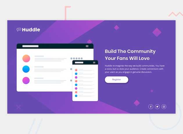
I am currently building the third project in the series whereby I am creating another landing page but this time I am using a lot of premade SVG files which I haven’t used before, but the concept is still the same where I have to try and build and replicate this page :
Once complete I will be using Vercel to deploy the site which I discovered yesterday seems to be very easy and fast to use when deploying static sites!
Updates:
My project is now complete! Check it out here: Huddle
Now it isn’t an exactly the same as you can see the social media icons are missing borders. But what was good was being able to use SVG files to actually create the background of the website which I didn’t know you could do. For future projects I may try and build my own svg images to use as background templates. During the process however as I was trying size the huddle logo I realised I didn’t know how to resize images. Despite I tried to use width with px sizing. It did not work so I went around digging and found that I could use em, which got me thinking even further.
What is the difference between px and em ?
As per w3schools : “Pixel is a static measurement, while percent and EM are relative measurements. The size of an EM or percent depends on its parent. If the text size of body is 16 pixels, then 150% or 1.5 EM will be 24 pixels (1.5 * 16). Look at CSS Units for more measurement units.”
Here at Engage Interactive there was a great article going even further in depth why we shouldn’t always use pixels.
Another great article to get a better understanding between :
- px
- em
- rem
here Media query units
